Industry defines the structure of our economy, of our work environment, of our personal mobility, and of our urban space. Furniture, buildings, artificial light, food: 99 percent of the things that surround us are influenced by industrial machines of some kind. Yet, industrialization as a single development goal, and industrialized as a descriptive term for the era we reside in, are completely outdated. The fundamental and most important element of our time, and the vital prerequisite for a constructive approach to industrialization, is information.
Knowledge Management – todays biggest challenge
In the knowledge economy that we’re living and doing business in, the absolute number one success factor is good knowledge management. Access to information, prioritization of information, creative combination of information and good information design are the principles that turn raw information into relevant information, that turn facts and figures into knowledge. Knowledge management is the biggest challenge of the so-called post-industrial era, an era that actually still depends on industry, but even more so on knowledge. Knowledge economy, knowledge society; whatever you call it, our era depends on it.
Can a text or a picture transport complex information?
Strangely enough, with the some 950 years that have passed since the invention of movable type printing, almost 200 years after photography was discovered, 125 years since the first movie, four decades after the first digital camera, and roughly 5 years since multi- media capable mobile devices reached the masses, what dominates the flow of today’s information is still speech and text. Well, to a certain extent also images, still and moving. But how on earth can a short text adequately reflect the ever growing degree of complexity involved in everything and anything? How can a single photo reveal the manifold transformation processes behind globalization? How can a short article explore the resource flows at the core of our economy? They simply cannot.
How to understand a complex state of affairs in a short time
To understand facts and contexts that involve a certain degree of complexity, you can either read a well-considered book from a clever author, follow a gifted lecturer, or consume a set of sophisticated documentaries. However, when it comes to understanding a complex state of affairs in a short time, there is another medium. Ever heard of diagrams?
Hungry for information? Break it down into delicious, easily digestible pieces
These days, anyone can access public statistics, public scientific journals, and public blogs. What we need, though, is someone to break down this dusty, complex pile of information into delicious, easily digestible pieces. We’re hungry for knowledge tapas. At a time when the Internet provides fully democratized access to information, how that abundance of information is delivered is more important than ever before. Very few people are familiar with how effectively diagrams can do the job.
Seeing a Sankey diagram gives you a precise idea of what goes where
Take Sankey diagrams as an example. People outside the engineering and accounting universe usually struggle with numbers. Even the handful of extraterrestrials that come from the strange planet of number-affinity have their difficulties with large ones. Large arrays of numbers are hard to grasp, it’s as simple as that. Well, the magical diagrams that I fancy so much, Sankey diagrams, are also based on numbers. But by displaying quantity flows proportionately, with bigger arrows for larger quantities and smaller arrows for smaller ones, they make numbers, and especially the proportions the numbers stand for, intuitively and immediately clear. Upon first seeing a Sankey diagram, you get a precise idea of what goes where. What’s more, you can also tell where what comes from and how much it is that goes there.
To give you an example, imagine an international trade flow for just one good. Some countries export it and some import it. For a good so traded by two countries, the task is easy. However, in a fully globalized world, there are political and commercial entities like the European Union. With almost 30 member states that all exchange the good with each other, you can image how high the level of complexity gets. Dealing with the trade of dozens of countries simultaneously, covering all necessary relations and aspects, would require a text at least a couple of pages long. But, as the following diagram taken from the sankey-diagrams.com blog demonstrates, the relations can be displayed in one, single Sankey diagram:
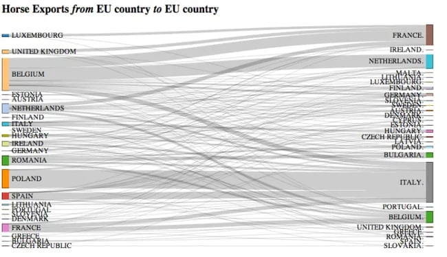
Diagram found at sankey-diagrams.com. Intra-European Horse Meat Trade Flows by Country. Created with d3.js Sankey plugin by Tony Hirst, Data from Eurostat. Taken from http://blog.ouseful.info/2013/02/18/reshaping-horse-importexport-data-to-fit-a-sankey-diagram/
On the left hand side, you see exporters of horse meat, and on the right hand side, the respective importers. The grey arrows represent the quantities of horse meat that are traded. As you can see, Belgium is by far the biggest exporter, followed by Poland. After these two leaders in horse meat export, four other countries follow: the Netherlands, Romania, Spain and France all export similar amounts. On the importer side, salami-maker Italy outranks all other countries by far. Italy is followed by France, the Netherlands, and Belgium.
The strength of the Sankey diagram – it also reflects interdependencies and interrelations
These rankings could easily be described in a list or in a text, too. But the strength of the Sankey diagram is it also reflects interdependencies and interrelations. The largest bilateral horse meat flow goes from Poland to Italy. The second largest from Belgium to Holland, and a similar quantity from Belgium to France. I could go on writing about this forever, but the point is, that this one diagram has it all covered on a few intuitively intelligible square inches.
Nothing beats a beautiful diagram for turning data into knowledge
Collections like the Sankey diagrams blog or information is beautiful show how powerful diagrams are. Nothing beats a beautiful diagram for turning data into knowledge. What’s clear, though, is that even a communication medium like a Sankey diagram can be designed in different ways. Generally, the simpler, the better. Every visual element will find it’s way to the viewer’s eye, whether you find it important or not. So as a diagram creator, you should thoroughly assess how the diagram can be reduced to the essentials. Keep it simple. Try to avoid anything that will distract the viewer. In order to let the flows stand for themselves, you can employ a legend or a description next to the actual diagram. The newest e!Sankey release (3.2, free trial download) includes a number of new design templates boasting clear features and nice looks. Another example of neatly clarifying a complex state of affairs is the following e!Sankey diagram. It depicts oil consumption flows in the US.
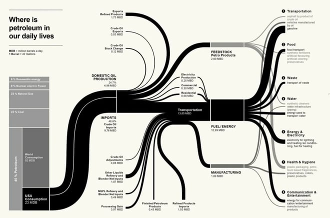
Article image made with e!Sankey, (c) ifu Hamburg GmbH.